Introduction
A very common tendency for beginners in UX/UI is to fill every brim of the canvas with all the information they want to put out there. This may make sense for specific websites where information has to be dense, like a spreadsheet or a dashboard. But oftentimes, including this case, cramming text and images degrades user experience.
“Cramming” in this context refers to two definitions: cramming contextually, and cramming spatially.
Cramming Contextually
Cramming contextually simply means writing/placing more information than a user can possibly process. Remember the last time you were forced to read something you didn’t want to read, say a required reading in school, or privacy policy agreements. Chances are, you probably skimmed over them, or did not read them at all. The same goes for websites. When a user visits your website, they often want to know the gist of what the deal is, not the every last bit of detail you have to offer. Adding excessive content can deter users away from your core message.
So our first step is to trim down the text to focus on the core message. Remember, this is not a school essay, you don’t get points for writing long essays. What matters is how efficiently and concisely you convey your message.
Ofcourse, as with anything in UX, the degree in which you apply this varies case by case. For instance, the paragraphs near the end have been unedited, on the assumption that users who reach there will already have a rough understanding of what the website is about, and are eager to learn more details.
You can see this in action on product pages like Apple: www.apple.com/ipad-air/.
You will notice that at the beginning, the website only uses short bursts of texts to give an overview of the product. As you scroll down, you see more details and numerical specs.
Cramming Spatially
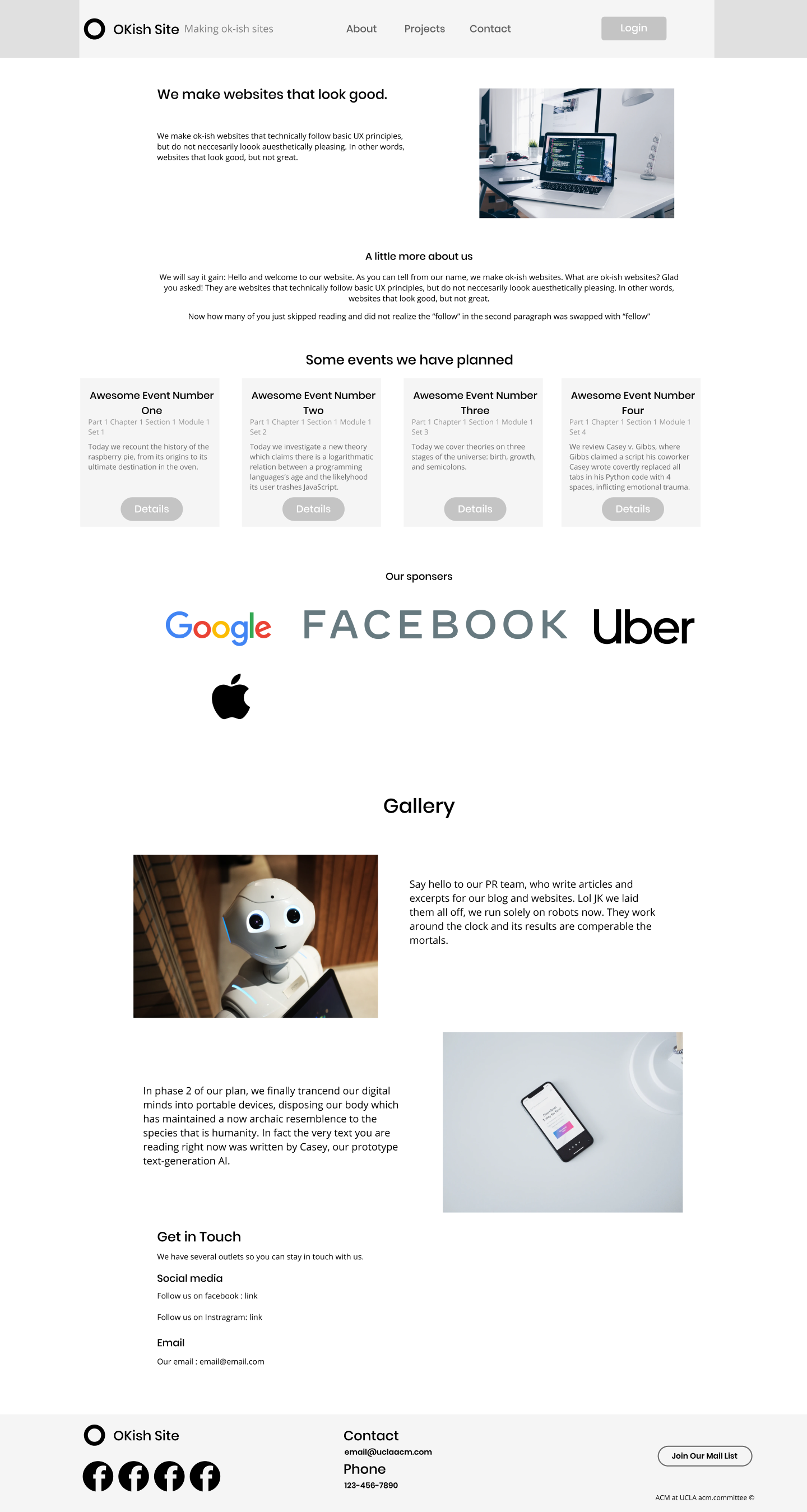
Another common pitfall for UX beginners to take existing elements and pack them into the screen like Tetris blocks. You can see this happening with our OKish website near the top:
In this single scene, we see the company abstract, description, details, events list, all at once. As space efficient as this may seem, in reality it often confuses the user, who, being presented with so much information at once, does not know what to look at first.
Ideally, we want to structure our website like we structure essays - that is, we lump together elements that are related into “paragraphs”. Furthermore, we want to add enough space so that at a given time, the user only sees a single prominent set of related elements.
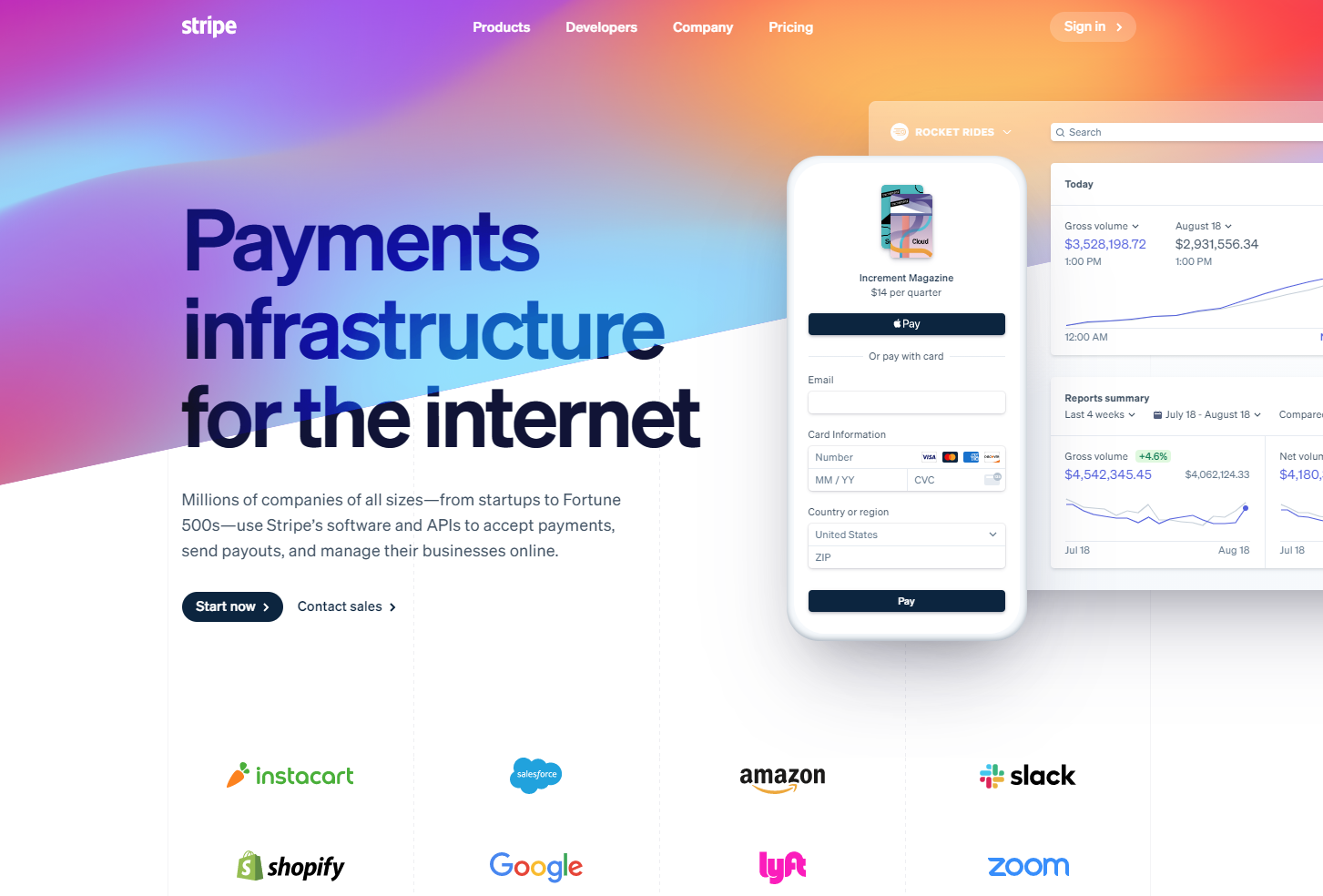
Take stripe for example. When you first visit stripe.com, you only see the catchphrase, a short description, and some accompanying graphics. Sure there are some company logos, but they are relatively small and not as distracting.
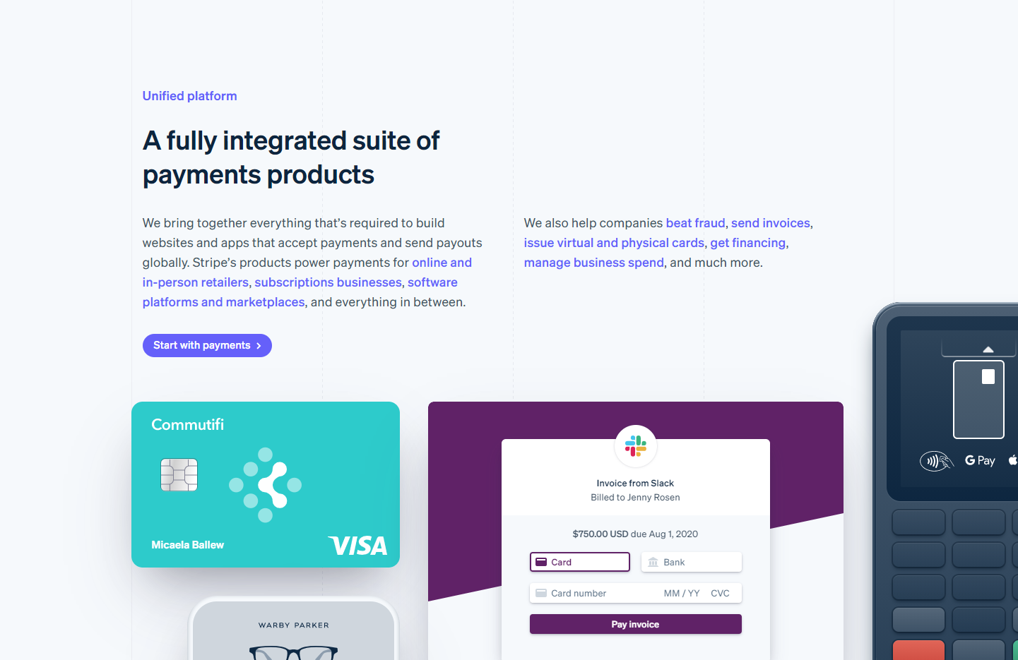
After scrolling down a bit, you see their description about their platforms. Again, you only see the tile, text, and graphics related to then platform, and nothing else:
Applying this to our mockup, we get something like this:
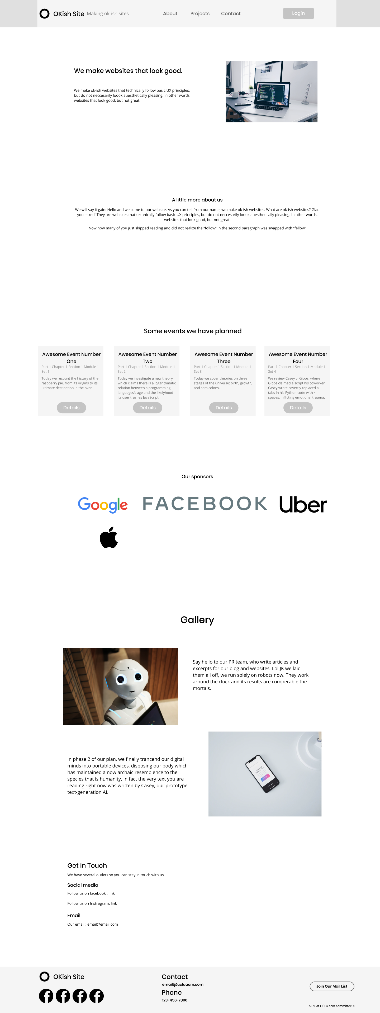
It looks rather awkward as we haven’t applied other optimizations yet, but we will get to that later. For now, notice how much it is easier to focus on the catchphrase and the image.
This is also a good time to start thinking about responsive design. What a user sees on the screen heavily depends on their screen size and resolution. For example, if you were to port this website to mobile, you would want extra vertical space as people usually hold their phone in portrait.
After enough tweaking, your website should now look like this:
Now we move on to our next topic, alignment.